From SQL Server to Power BI: Turning Northwind Data into an Interactive Dashboard
From SQL Server to Power BI
Introduction
In the first part of this project, I worked with the Northwind dataset directly in SQL Server.
The objective was to understand how a relational database works and progressively develop my SQL skills, starting with basic data retrieval and filtering and moving towards more advanced concepts such as joins, subqueries, CTEs and window functions.
Once the SQL analysis was completed, I wanted to take the same database one step further.
Instead of working only with individual SQL query results, I wanted to transform the information into an interactive Business Intelligence report using Power BI.
The objective of this second part was therefore not simply to create charts.
I wanted to understand how the database and analytical logic developed in SQL could be transformed into:
- a Power BI data model;
- reusable DAX measures;
- KPIs;
- interactive visualisations;
- filters and slicers;
- business-oriented analysis.
The progression of the project therefore became:
SQL Server database
↓
Power BI
↓
DAX measures
↓
KPIs and calculations
↓
Business analysis
↓
Interactive report
The final Power BI report was divided into five main analytical pages:
- Overview
- Customer Analysis
- Product and Category Analysis
- Sales Analysis
- Operations Analysis
1. Objectives of the Power BI Project
The main objective of this second part was to transform the Northwind relational database into an interactive Business Intelligence report.
More specifically, I wanted to:
- connect Power BI to my existing SQL Server database;
- use the tables and relationships already created during the SQL project;
- verify the data model before starting the analysis;
- create reusable calculations using DAX;
- create KPIs;
- analyse customers and their spending;
- analyse products and categories;
- analyse sales over time;
- analyse operational activity;
- create interactive visualisations;
- use slicers to allow the user to explore the data;
- bring the most important information together in an Overview page.
There is also an important difference between the two parts of the project.
In the SQL part, I was mainly learning how to retrieve, filter, join, aggregate and analyse data.
In Power BI, the objective became to transform that analytical work into something that could be explored visually and interactively.
The progression was therefore:
How can I retrieve this information?
↓
How can I calculate it?
↓
How can I visualise it?
↓
How can I allow someone to explore it interactively?
2. Connecting SQL Server to Power BI
The Northwind database had already been created and populated in SQL Server during the first part of the project.
The tables had also been checked and the relationships between them had already been established.
This meant that I did not need to recreate the database inside Power BI.
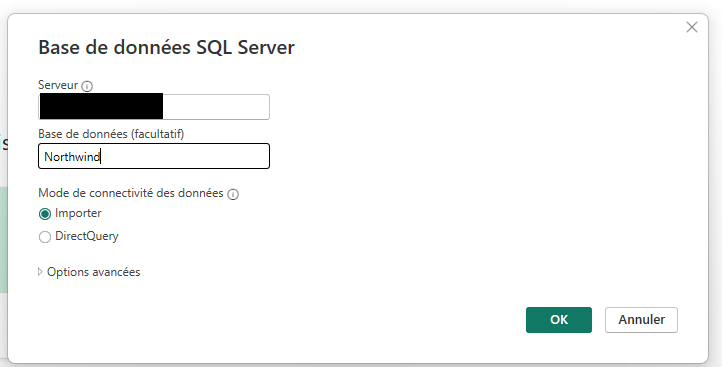
Instead, I connected Power BI to the existing SQL Server database using the SQL Server connector, specifying the server and the Northwind database, and choosing Import as the data connectivity mode.
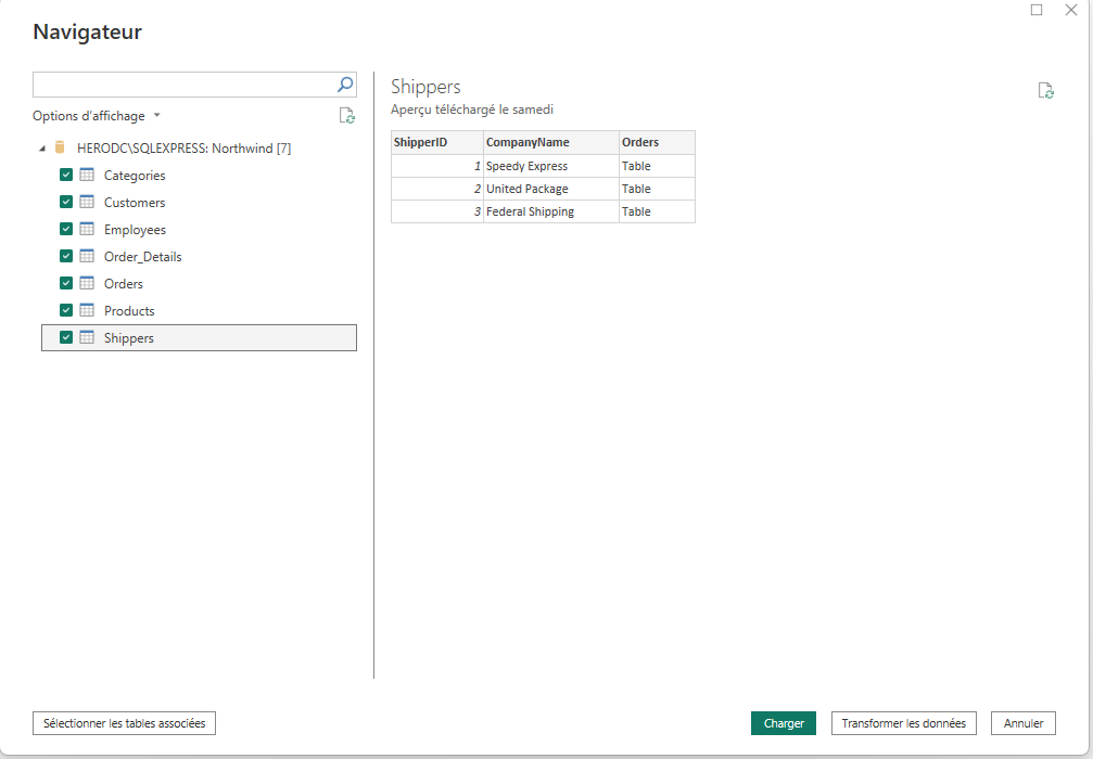
Once connected, Power BI’s Navigator displayed every table available in the Northwind database. I selected all seven tables : Categories, Customers, Employees, Order_Details, Orders, Products and Shippers — so that the complete relational structure would be available in the report.
The important point here is that Power BI became the analytical and visualisation layer while SQL Server remained the source database.
This allowed me to continue working with the same relational structure that I had developed during the SQL stage.
3. Checking the Data Before Building the Report
Before creating the visualisations, I checked the data that had been brought into Power BI.
The Northwind database contains several related tables, including:
- Customers
- Orders
- Order_Details
- Products
- Categories
- Employees
- Shippers
The relationships between these tables are essential because the information needed for an analysis is often distributed across several tables.
For example:
Customers
↓
Orders
↓
Order_Details
↓
Products
Inside Power Query, I reviewed each table individually before loading it into the model. For the Customers table, this meant confirming that every column — CustomerID, CompanyName, ContactName, ContactTitle, City, Country — had loaded with valid values and no unexpected errors.
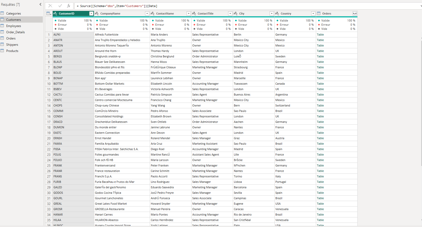
This meant that I could focus on the analytical side of the project rather than spending the report section rebuilding the database, since the underlying structure had already been validated during the SQL stage.
4. Creating a Date Table
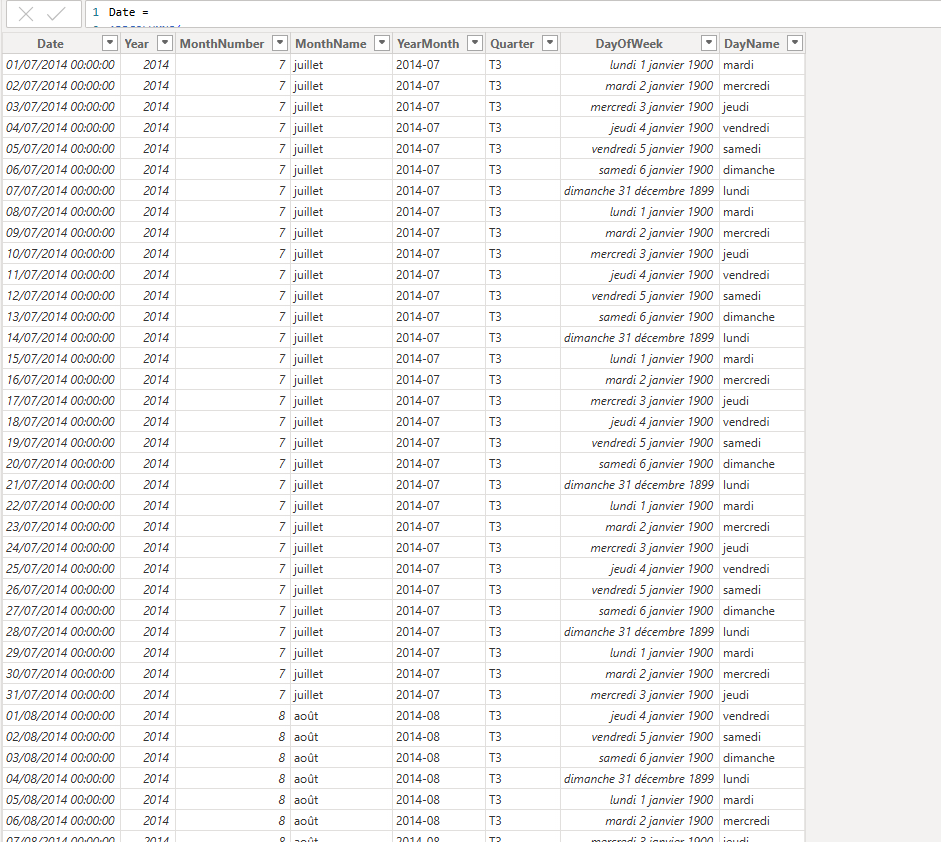
One of the first additional modelling steps I performed in Power BI was the creation of a dedicated date table.
This was useful because several of the analyses in the report are based on time.
For example:
- monthly revenue;
- number of orders by month;
- yearly analysis;
- previous month sales;
- monthly growth percentage.
A dedicated date table provides a better structure for time-based analysis and makes it easier to work with DAX time intelligence.
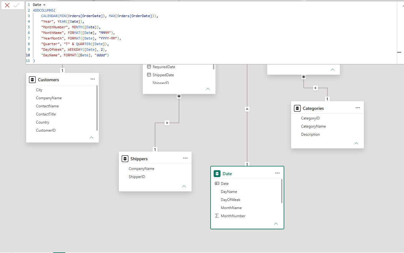
The date table therefore became part of the Power BI model used for the time-based pages.
5. From SQL Calculations to DAX
One of the most important parts of the transition from SQL Server to Power BI was understanding the difference between SQL queries and DAX measures.
SQL and DAX can sometimes answer similar analytical questions, but they do not work in exactly the same way.
In the SQL project, I used queries to retrieve, filter, group and calculate information.
In Power BI, I started creating measures that could be evaluated dynamically according to the context of the report.
This became particularly important when using slicers.
For example, a total revenue measure should not simply return one fixed number.
If the user filters the report by country, customer, year or category, the measure should update according to that filter context.
This is one of the main advantages of using measures in Power BI.
6. Creating the Total Payments Measure
One of the main calculations used throughout the project was revenue or total payments.
In the SQL analysis, I calculated revenue from the order details using:
Unit Price × Quantity × (1 − Discount)
This calculation had already been used several times during the SQL analysis to calculate sales by:
- product;
- customer;
- category;
- country.
In Power BI, I recreated this business logic as a reusable DAX measure.
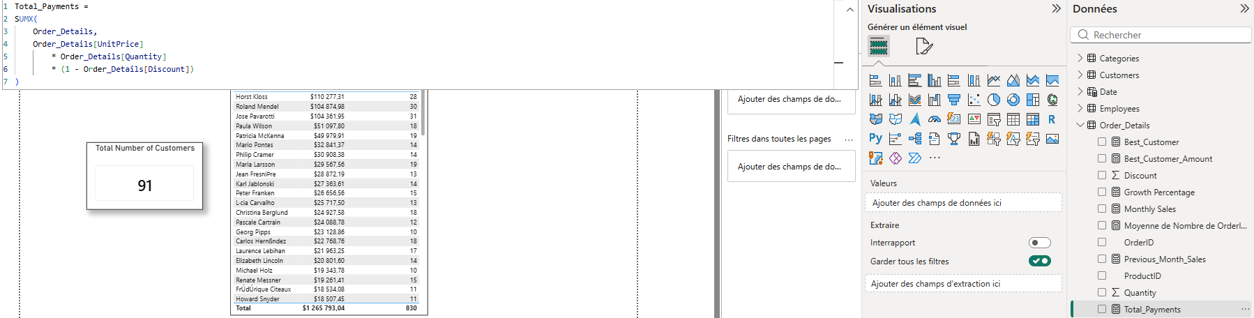
The important difference is that the measure can react to the current filter context.
The same measure can therefore be used to display:
- total revenue;
- revenue for a specific customer;
- revenue for a specific country;
- revenue for a specific category;
- revenue for a specific period.
The calculation becomes reusable throughout the report instead of being tied to one specific SQL query.
7. Creating the Main KPIs
Once the main measures had been created, I used them to build the key indicators displayed throughout the report.
Some of the important calculations included:
- total payments;
- total customers;
- total orders;
- best customer;
- best customer’s spending;
- previous month sales;
- growth percentage.
The purpose of these KPIs was to make the most important information immediately visible.
Instead of forcing the user to analyse several tables before understanding the general situation, the main indicators can be displayed directly on the report pages.

I also created a separate measure to calculate the amount spent by the best customer.

These measures are then used in the Overview page.
8. Page 1 — Overview
The first page of the report is the Overview page.
The purpose of this page is to provide a quick summary of the business activity contained in the Northwind dataset.
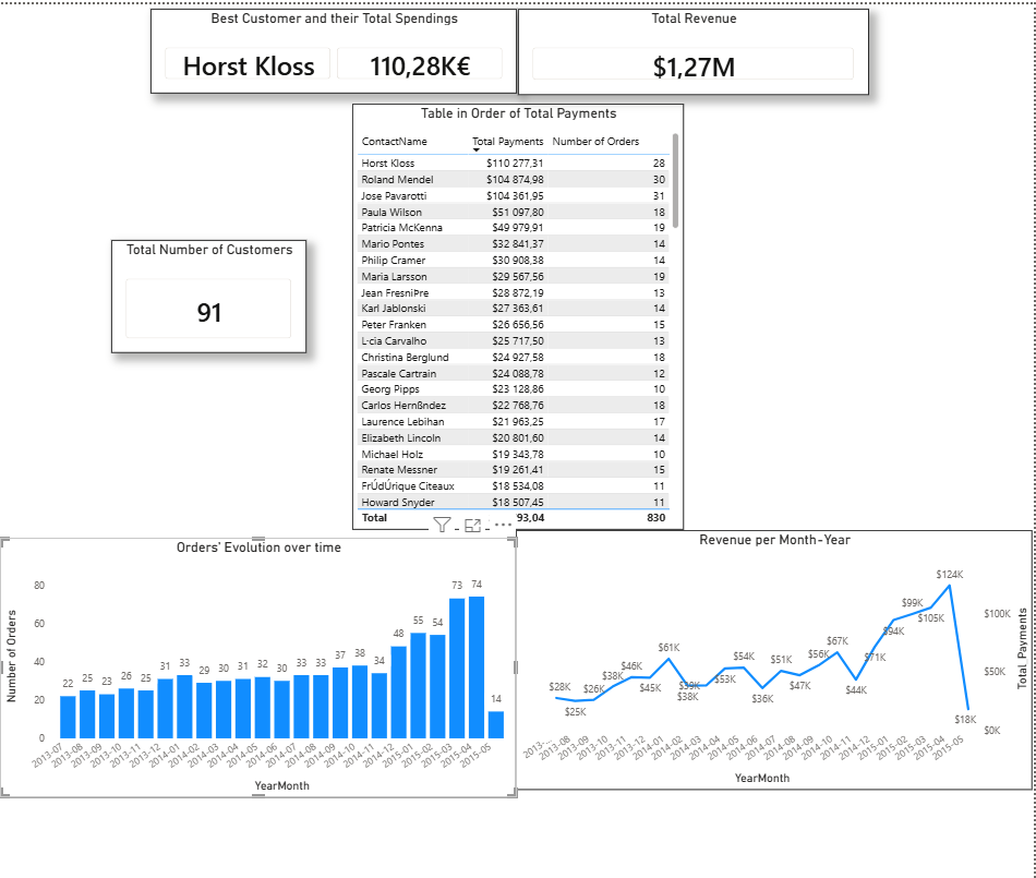
The page brings together several high-level indicators and visualisations.
Among them are:
- the best customer;
- the spending generated by the best customer;
- the number of customers;
- the number of orders over time;
- total payments over time;
- detailed order information.
The objective was not to put every possible analysis on the first page.
Instead, the Overview acts as the entry point to the report.
The user should be able to understand the general situation before moving towards the more specialised analytical pages.
9. Best Customer and Customer Spending
One of the KPIs displayed on the Overview page identifies the best customer according to their total spending.
This analysis builds directly on the customer revenue calculations developed during the SQL stage.
The Power BI version is dynamic, meaning that the result can change depending on the selected filters.
The two measures work together:
Best Customer
↓
Total Spending of Best Customer
This demonstrates how a calculation that was originally explored through SQL can become a reusable Power BI metric.
10. Orders and Revenue Over Time
The Overview page also contains two important time-based analyses.
The first shows the number of orders over time.
The second shows total payments over time.
These visualisations make it easier to identify periods of higher or lower activity than would be possible by looking at individual SQL query results.
This is one of the first major advantages of moving from individual SQL results to Power BI.
Instead of looking at a static result set, the information can now be interpreted visually.
11. Page 2 — Customer Analysis
The second page focuses specifically on customers.
The objective was to understand the customer base and identify which customers and countries contribute the most to the business.
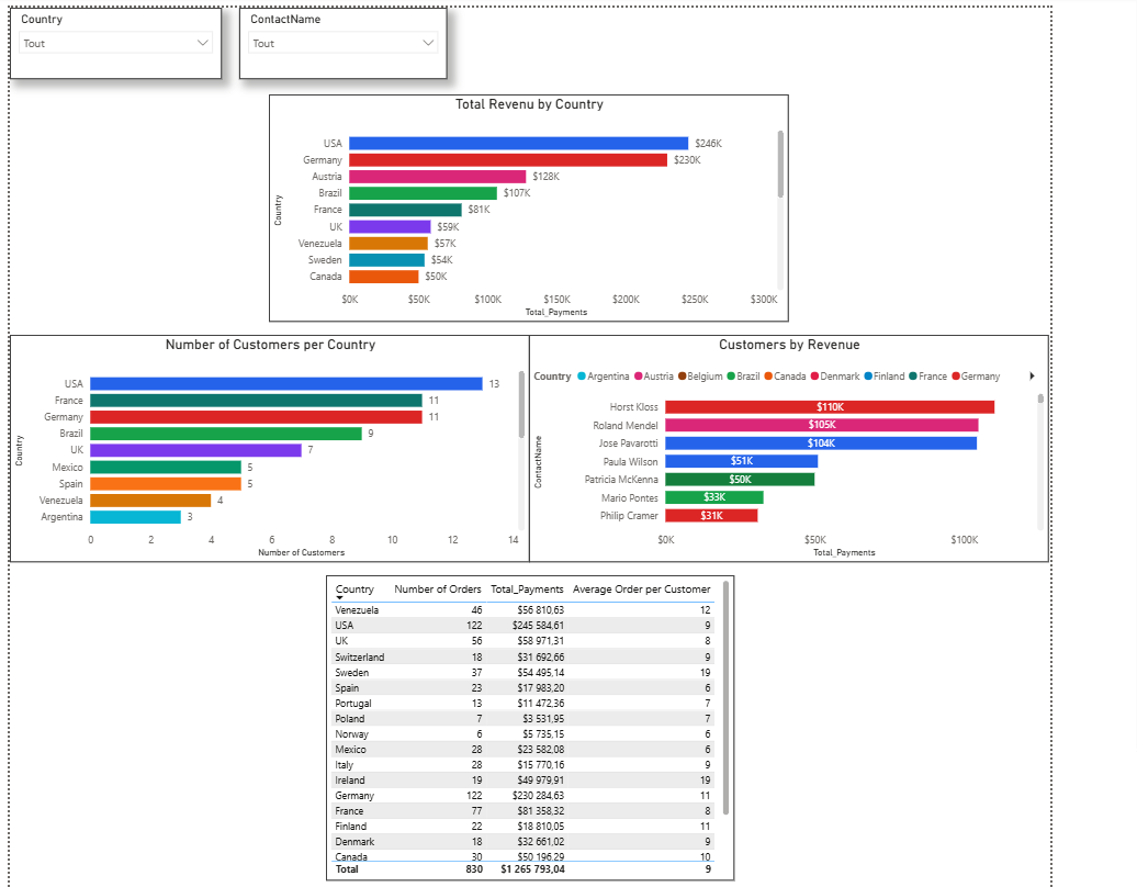
The page contains several analyses, including:
- top customers by revenue;
- number of customers by country;
- revenue by country;
- detailed customer information;
- customer filters.
This page therefore moves from a general overview towards a more specific analysis of customer behaviour.
12. Top Customers by Revenue
The first customer analysis identifies the customers generating the highest revenue.
This visual makes it possible to quickly identify the customers that contribute the most to total revenue.
It also demonstrates the difference between simply counting customers and analysing their financial contribution.
A customer base can therefore be analysed not only by size but also by value.
13. Customers and Revenue by Country
The customer page also compares countries according to both their number of customers and the revenue generated.
These two analyses should not necessarily produce the same ranking.
A country can have many customers without generating the highest revenue.
This distinction is important because customer volume and customer value are two different dimensions of analysis.
The customer page therefore allows the data to be viewed from both perspectives.
14. Interactive Customer Analysis
The customer page also contains filters that allow the user to explore the data.
Depending on the report configuration, the analysis can be filtered by dimensions such as:
- Country
- Customer
The purpose of these filters is to move from a general analysis towards a specific segment.
For example, instead of looking at all customers, the user can select a particular country and immediately see the relevant visualisations update.
This is one of the important differences between a static SQL result and an interactive Power BI report.
15. Page 3 — Product and Category Analysis
The third page focuses on products and categories.
The objective is to identify which products and categories contribute most to sales.
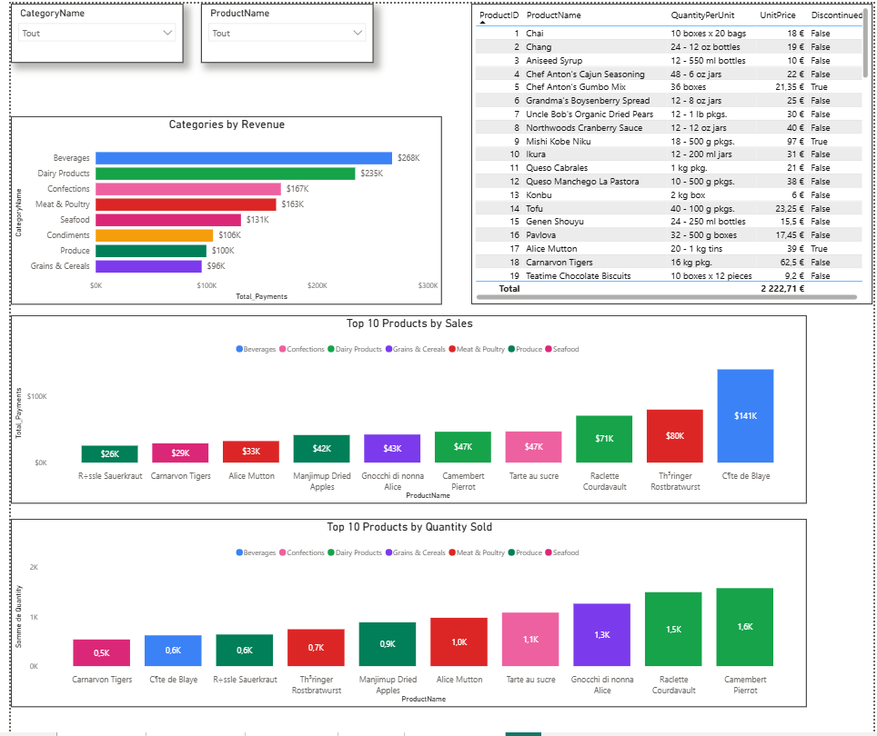
The main analyses include:
- top products by revenue;
- top products by quantity sold;
- revenue by category;
- detailed product information;
- product and category filters.
This page builds directly on the product and category analysis performed during the SQL stage.
16. Top Products by Revenue
The first product analysis identifies the products generating the most revenue.
This analysis builds on the revenue calculation developed during the SQL project.
However, instead of simply returning a ranked SQL result, Power BI allows the result to be explored through the report and its filters.
This makes the analysis more flexible.
17. Revenue Compared with Quantity Sold
I also created an analysis of the products sold in the highest quantities.
This creates an interesting comparison.
The product that sells the most units is not necessarily the product that generates the most revenue.
This distinction is important when analysing product performance because:
Sales volume ≠ Financial contribution
A product can have a very high quantity sold but a relatively low total revenue.
Another product may sell fewer units but generate considerably more revenue.
Looking at both metrics therefore gives a more complete picture of product performance.
18. Revenue by Category
Another important analysis looks at revenue at the category level.
The calculation relies on the relationships between:
Categories
↓
Products
↓
Order_Details
The same relational structure that was used in SQL can therefore be used inside Power BI to build an interactive category analysis.
This makes it possible to compare the financial contribution of the different product categories.
19. Page 4 — Sales Analysis
The fourth page focuses on sales performance over time.
This page is particularly important because it connects the SQL analysis from Part 1 with the analytical capabilities of Power BI.
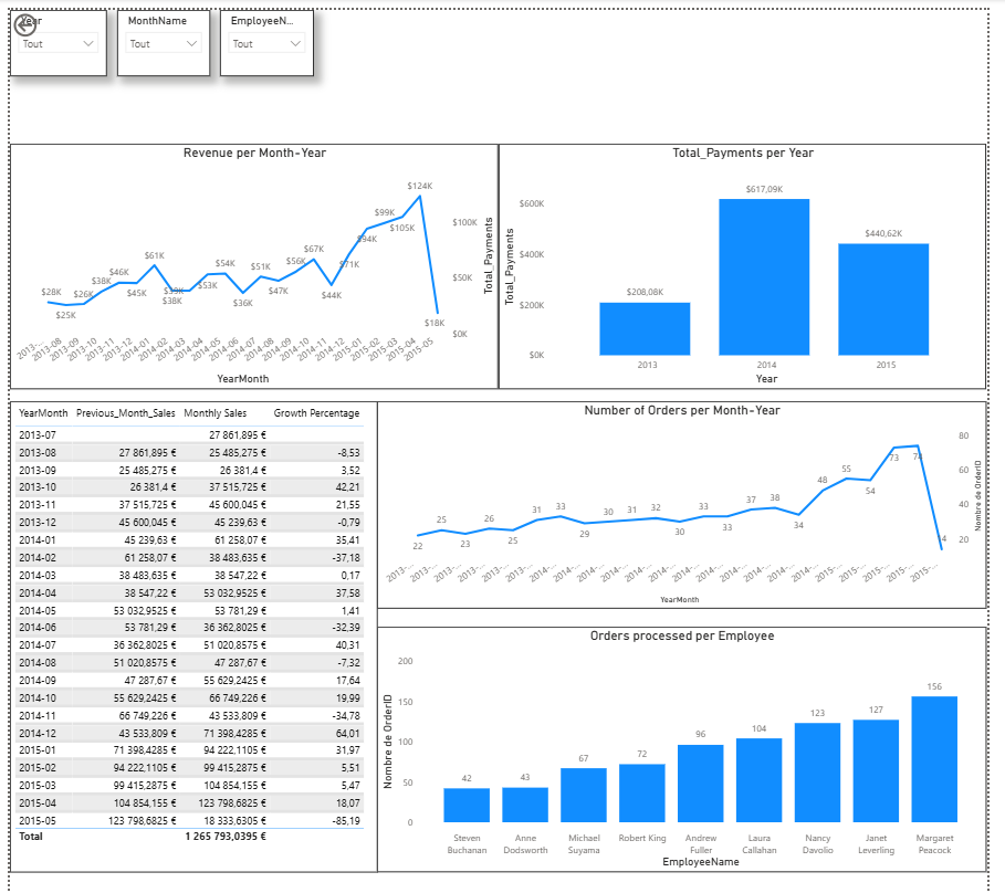
The page contains analyses related to:
- monthly revenue;
- monthly order volume;
- yearly revenue;
- orders processed by employees;
- previous month sales;
- monthly growth percentage.
The report also uses time-related filters such as:
- Year;
- Month;
- Employee.
This page therefore focuses on understanding how sales activity changes over time.
20. Monthly Revenue
The first sales analysis looks at revenue over time.
The monthly sales measure was created in DAX so that the value can be displayed dynamically in the report.

The result can then be displayed visually on the Sales page.
This allows the user to identify periods where revenue increased or decreased.
The same type of analysis was previously performed in SQL using aggregation by month.
The difference is that Power BI can now present the result interactively.
21. Monthly Orders
I also analysed the number of orders placed during each period.
Comparing order volume with revenue provides additional context.
An increase in the number of orders does not necessarily mean that revenue increased by the same proportion.
This makes it useful to analyse both metrics rather than relying on only one.
22. From SQL LAG() to Power BI
One of the most important parts of this project was reproducing the month-over-month analysis that I developed during the SQL stage.
In SQL, I used a CTE together with the LAG() window function.
The objective was to retrieve the previous month’s sales and compare them with the current month.
The logic was:
Current Month Sales
↓
Previous Month Sales
↓
Difference
↓
Growth Percentage
The original SQL analysis from Part 1 used a double CTE and LAG() to perform this calculation.
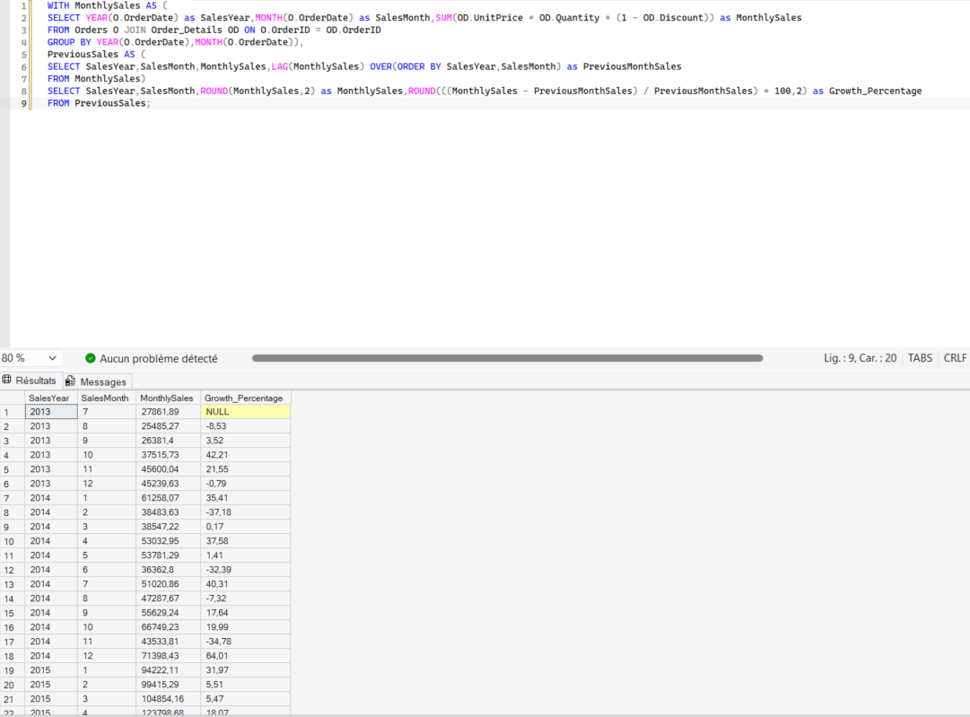
I then recreated this analytical logic in Power BI using DAX.
The first measure retrieves the previous month’s sales.

I then created a growth percentage measure to compare the current month with the previous month.

This was an important transition in the project.
The analytical question remained the same, but the implementation changed.
In SQL, the calculation was performed using a query and LAG().
In Power BI, the calculation became a dynamic measure that can react to the report context.
23. Monthly Growth Percentage
The final result is displayed as a monthly growth percentage.
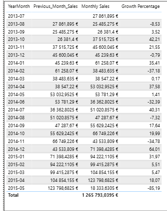
The purpose of this metric is to determine whether sales increased or decreased compared with the previous month.
Instead of only knowing how much revenue was generated, I can also evaluate the direction and rate of change.
This adds another analytical dimension to the report.
It also demonstrates one of the main benefits of recreating analytical logic as a DAX measure.
The result is no longer simply a static query output.
It can respond to the context of the Power BI report.
24. Page 5 — Operations Analysis
The final analytical page focuses on operational activity.
The objective is to understand how orders are distributed between employees, shippers and customers.
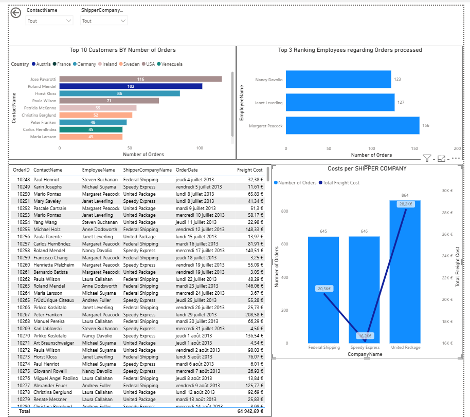
The page contains analyses related to:
- orders processed by employees;
- orders handled by shippers;
- customers according to order volume;
- detailed order information.
This page therefore looks at the operational side of the business rather than focusing only on revenue.
25. Orders Processed by Employees
The first operational analysis looks at the number of orders associated with each employee.
This provides an indication of how order activity is distributed across employees.
The purpose here is different from the customer and product analyses.
The focus is now on operational activity rather than financial performance.
26. Orders by Shipper
I also analysed the number of orders associated with each shipping company.
The analysis uses the relationship between the Orders and Shippers tables.
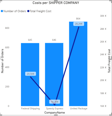
I also created a specific analysis around freight costs.
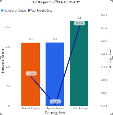
This provides another operational perspective on the Northwind data.
Instead of analysing only how much was sold, the report can also be used to investigate the logistics side of the business.
27. Customers by Number of Orders
The Operations page also identifies customers according to the number of orders they have placed.
This is different from the customer analysis based on revenue.
A customer can place many orders without necessarily being the customer generating the most revenue.
This again demonstrates why different metrics are necessary to understand the business from different perspectives.
28. Using Slicers to Explore the Report
Another important feature of the Power BI report is interactivity.
Depending on the page, users can filter the analysis using dimensions such as:
- Year
- Month
- Employee
- Country
- Customer
- Product
- Category
The purpose of these filters is to allow the user to move from a general analysis to a more specific one.
For example, instead of looking at total revenue for every customer, the user can select a particular country and immediately see the relevant visualisations update.
This is one of the main differences between a static SQL result and an interactive Power BI report.
The SQL query gives me the result I ask for.
Power BI allows the user to explore the result without having to rewrite the query every time.
29. From Individual SQL Queries to a Business Intelligence Report
Looking back at the two parts of the project, the objective was never to reproduce every SQL query inside Power BI.
The SQL exercises were used to develop my understanding of:
- the relational database;
- table relationships;
- filtering;
- aggregation;
- joins;
- subqueries;
- CTEs;
- window functions;
- analytical logic.
Power BI then transformed that foundation into a visual and interactive format.
The progression was therefore:
SQL
↓
SELECT
↓
WHERE
↓
GROUP BY
↓
JOIN
↓
Aggregations
↓
Subqueries
↓
CTEs
↓
Window Functions
↓
Power BI Data Model
↓
DAX Measures
↓
KPIs
↓
Visualisations
↓
Filters
↓
Interactive Analysis
This also highlights why I chose to connect SQL Server to Power BI rather than simply treating the two technologies as separate projects.
SQL allowed me to work directly with the relational database and understand how the data was structured.
Power BI allowed me to take that prepared structure and turn it into a report designed for analysis and exploration.
30. What I Learned from the Transition
The main lesson from this second part of the project was that SQL and Power BI are not competing tools.
They serve different purposes within the analytical workflow.
SQL allowed me to understand:
- how the tables are structured;
- how relationships work;
- how to retrieve information;
- how to aggregate data;
- how to answer increasingly complex analytical questions.
Power BI then allowed me to take that foundation further.
It allowed me to:
- create reusable calculations;
- visualise trends;
- compare different dimensions;
- create interactive filters;
- present KPIs;
- build a report designed for exploration.
The transition therefore became:
SQL for querying and understanding the relational data
↓
Power BI and DAX for interactive analysis and communication
One of the clearest examples is the month-over-month growth calculation.
In SQL, I used:
CTE + LAG()
to calculate the previous month’s sales and growth percentage.
In Power BI, I recreated the same analytical idea using DAX measures.
The question stayed the same.
The way the calculation was implemented changed.
This helped me understand that learning SQL and Power BI together is not simply about learning two separate technologies.
It is about understanding how different tools can be used at different stages of the same data analysis workflow.
31. Final Report
Each page has a different purpose.
The Overview provides the general picture.
The Customer page focuses on customer value and geographic distribution.
The Product page focuses on products and categories.
The Sales page focuses on time-based performance and growth.
The Operations page focuses on employees, shippers and order activity.
Conclusion
The second part of this project allowed me to move from SQL-based analysis to Business Intelligence.
The first part of the project focused on understanding and querying the Northwind relational database.
I started with basic SQL queries and progressively worked towards more advanced analytical techniques such as subqueries, CTEs and window functions.
Power BI allowed me to build on that foundation.
Instead of working with individual query results, I created reusable DAX measures and interactive visualisations.
The report was organised around five analytical perspectives:
Overview
↓
Customers
↓
Products and Categories
↓
Sales
↓
Operations
One of the most important transitions was the move from SQL calculations to DAX.
For example, the month-over-month growth analysis that I previously implemented using a SQL CTE and LAG() was recreated in Power BI as a dynamic calculation.
This demonstrated that the objective was not simply to learn two separate technologies.
The objective was to understand how they can work together within a data analysis workflow.
The final process can therefore be summarised as:
Raw data
↓
SQL Server
↓
Relational database
↓
SQL analysis
↓
Power BI
↓
DAX
↓
Interactive dashboard
The project ultimately allowed me to move from simply querying data to presenting that data in a format that can be explored, filtered and interpreted interactively.
This completes the Northwind SQL to Power BI project.
Thank you for taking the time to explore this project. It forms part of my data analytics portfolio and showcases my ability to work with a relational database in SQL Server and transform that analysis into an interactive Power BI report. Feedback and suggestions are always welcome.
This project was built using the Northwind sample dataset, with SQL Server as the data source and Power BI Desktop for the analysis and reporting, as part of my ongoing data portfolio.