Power BI Project:Superstore Sales Analysis
##Introduction
For this first data project published on my blog, I chose to work with the classic Superstore dataset ,a fictional retail company selling furniture, office supplies, and technology products across multiple regions in the United States. This dataset is widely used in the data analytics community and is a great playground to practice business intelligence techniques.
The goal of this project was to build a complete and interactive Power BI report that answers three key business questions: How are sales and profits evolving over time? Who are our best customers and top-performing products? And how efficient are our operations and shipping?
To answer these, I structured the report into three pages, each with a specific analytical focus:
- Executive Overview : a high-level snapshot of overall performance
- Product & Customer Analysis : a deep dive into what sells and who buys
- Operations & Profitability Analysis : an examination of shipping efficiency and margin drivers
The data model follows a star schema with a central fact table (FACTSALES) linked to three dimension tables: DimProduct, DimCustomer, and DimDate.
Page 1 Executive Overview
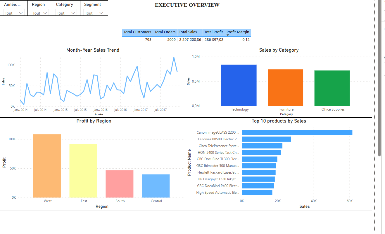
This page serves as the landing dashboard. It gives decision-makers an immediate overview of the business through four key charts and a KPI summary table. Four slicers (region, category, segment, and date) allow dynamic filtering across the entire page.
Chart 1 Month-Year Sales Trend (Line Chart)
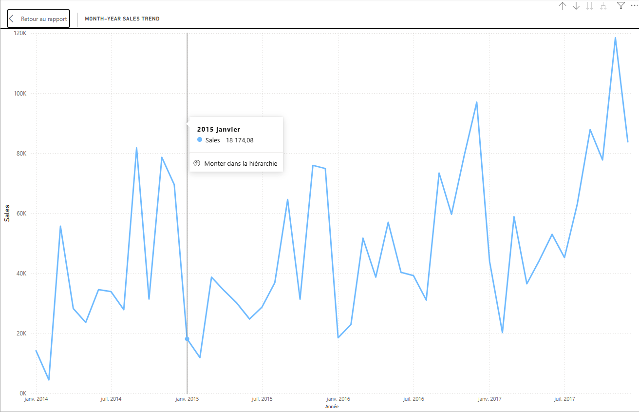
This line chart displays the evolution of total sales over time, broken down by year and month. It allows the reader to quickly identify seasonal peaks, growth trends, and any drops in revenue. The time axis uses a date hierarchy (Year → Month) built from the DimDate table.
Chart 2 Profit by Region (Column Chart)
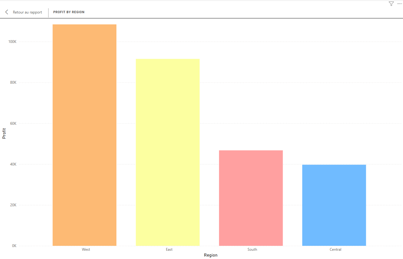
This column chart compares total profit across the four main regions (Central, East, South, West). It is a straightforward but essential view to understand which territories are the most profitable and where the business may need to refocus its efforts.
Chart 3 KPI Summary Table (Table)

Positioned at the top center of the page, this table provides a quick read on key performance indicators,including total orders, total sales, and total profit. It works as a reference anchor for the rest of the page.
Chart 4 Sales by Category (Column Chart)
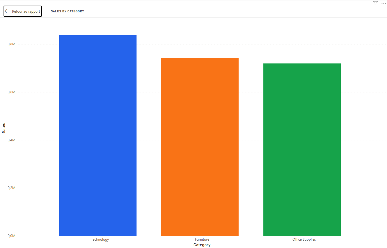
This chart compares total sales across the three main product categories: Furniture, Office Supplies, and Technology. It gives an instant read on which category drives the most revenue and helps contextualize the profitability data seen in other visuals.
Chart 5 Top 10 Products by Sales (Bar Chart)
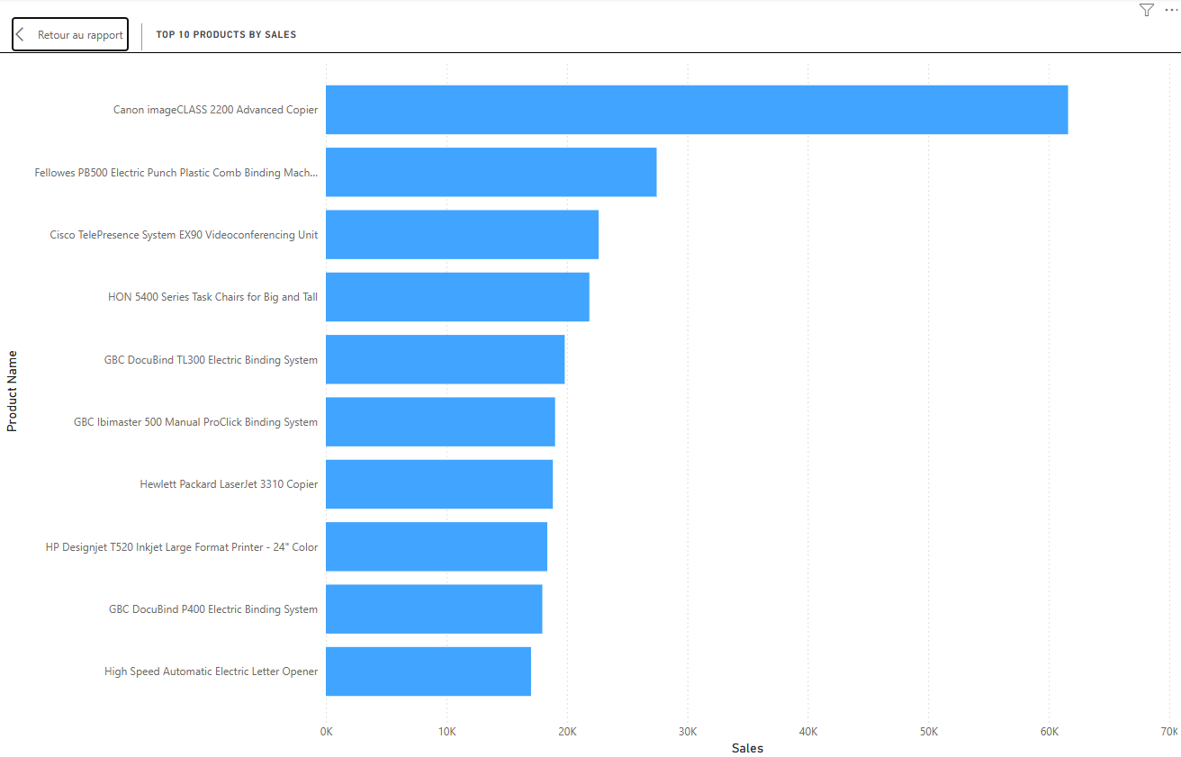
This horizontal bar chart ranks the ten best-selling products by total sales. It is useful to identify star products and understand what is driving category-level performance. Product names come from the DimProduct dimension table.
Page 2 Product & Customer Analysis
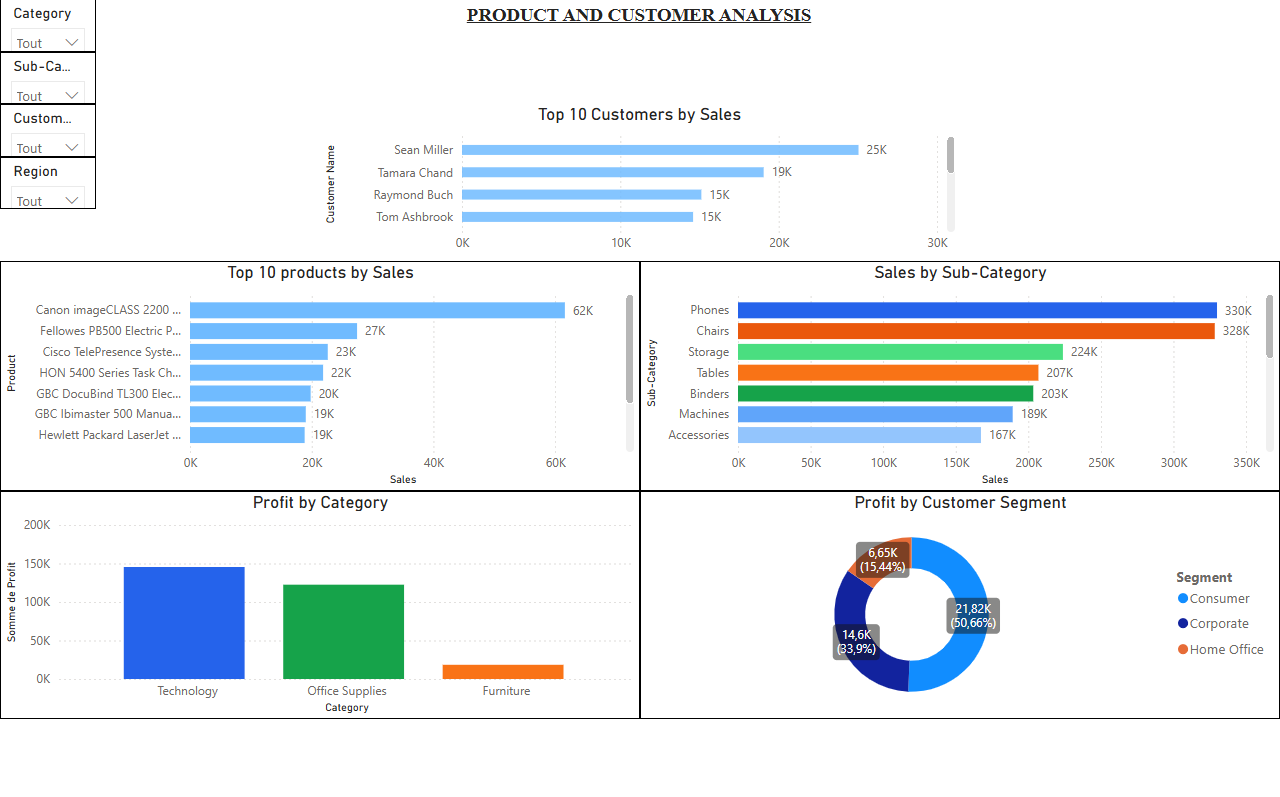
This page goes deeper into the product catalog and customer base. It answers questions like: Which sub-categories are performing well? Who are the most valuable customers? Which segments generate the most profit?
Chart 6 Top 10 Products by Sales (Bar Chart)
A product-level bar chart used here as a starting point for the product-focused analysis page. It provides continuity and context before drilling into sub-category and customer data.
Chart 7 Profit by Category (Column Chart)
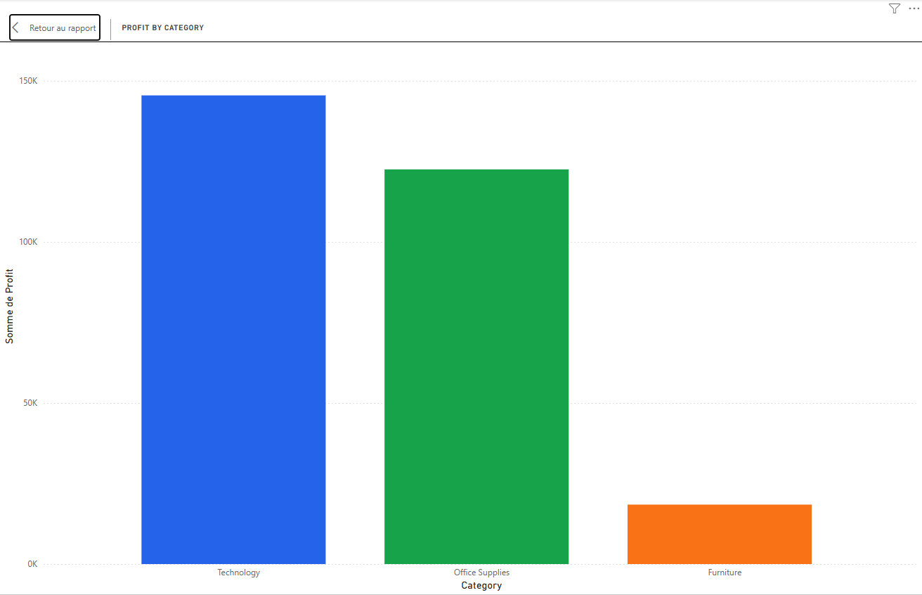
While page 1 showed sales by category, this chart focuses on profit. The distinction is important: a category can generate high revenue but low (or even negative) profit. This visual highlights where the real margins are.
Chart 8 Top 10 Customers by Sales (Bar Chart)
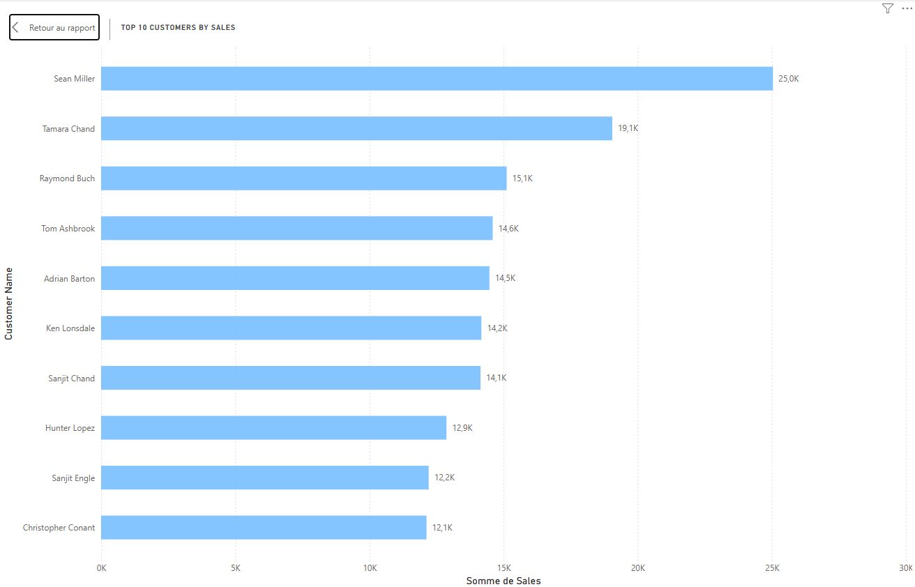
This chart identifies the ten most valuable customers ranked by total sales. For a retail business, understanding the top customer base is key to loyalty and CRM strategies.
Chart 9 Sales by Sub-Category (Bar Chart)
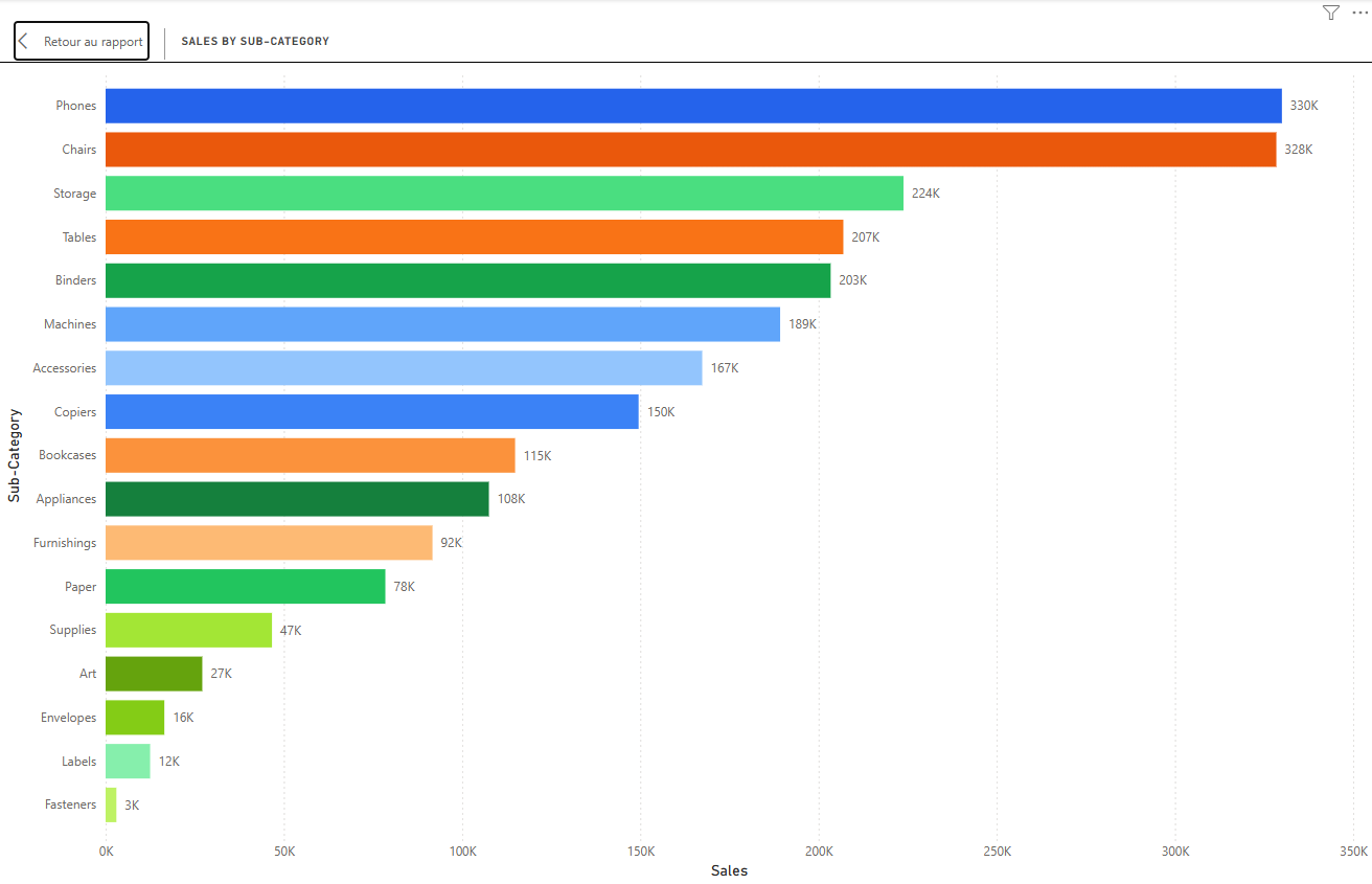
This chart breaks sales down to a more granular level, showing performance across all product sub-categories (e.g., Chairs, Phones, Binders…). It helps identify hidden gems and underperformers within each main category.
Chart 10 Profit by Customer Segment (Donut Chart)
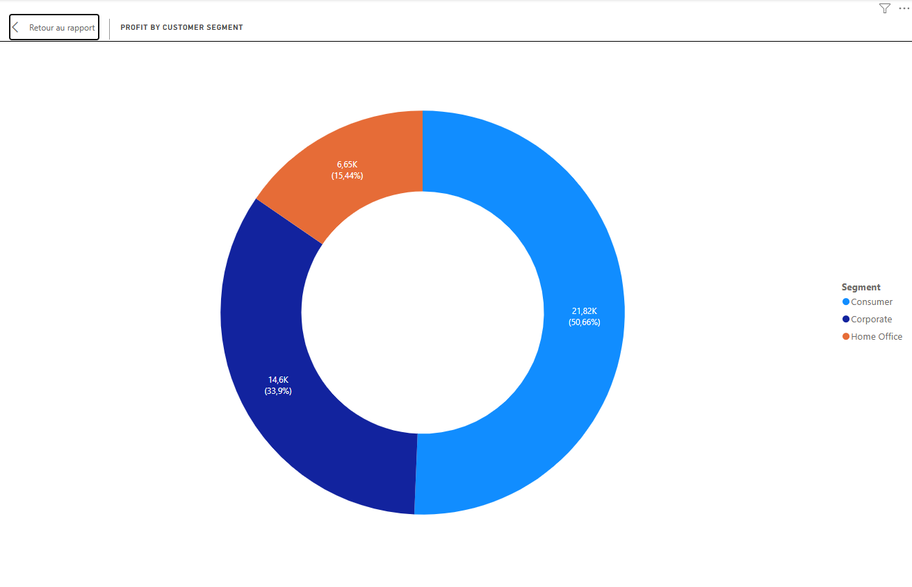
The three customer segments (Consumer, Corporate, and Home Office) are compared here by their contribution to total profit. The donut chart format makes it easy to read proportional share at a glance, and reveals which segment is the most profitable relative to its size.
Page 3 Operations & Profitability Analysis
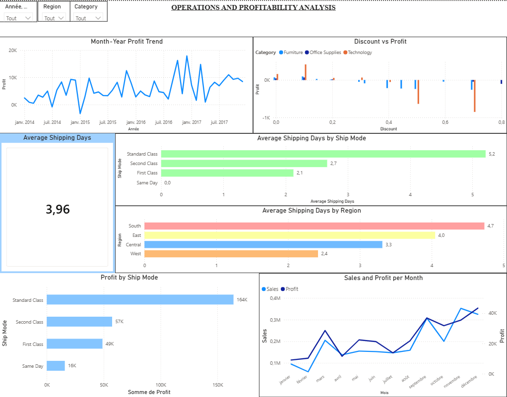
The third page shifts from “what” to “how”. It examines shipping efficiency, the impact of discounts on profit, and the combined monthly evolution of sales and profit. This is where operational decisions and pricing strategies come under scrutiny.
Chart 11 Month-Year Profit Trend (Line Chart)
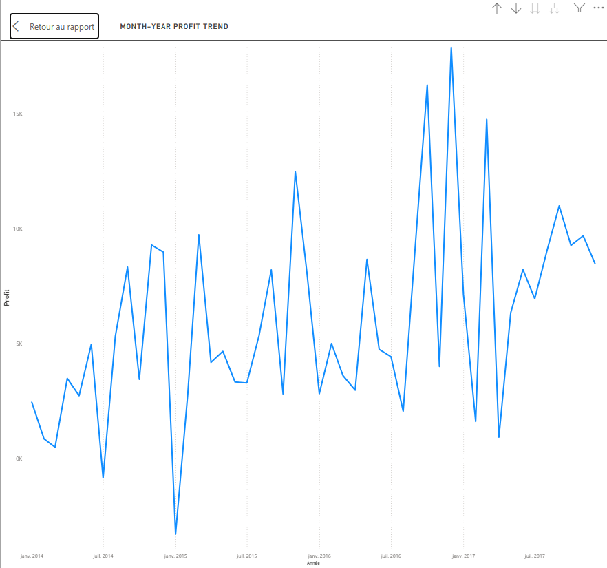
This line chart tracks profit over time by year and month. Comparing it to the sales trend from page 1 reveals whether revenue growth translates into proportional profit growth or whether costs and discounts are eroding margins.
Calculated Column and Measure — Average Shipping Days
The Calculated Column
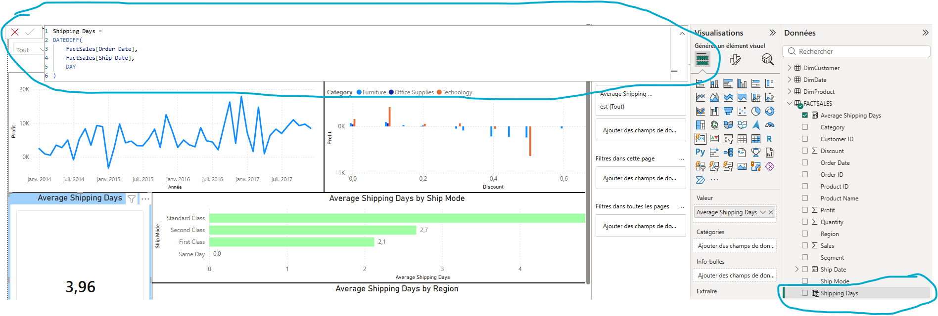
Before creating any measure related to shipping performance, a calculated column called Shipping Days had to be added directly to the FACTSALES table. A calculated column computes a value row by row at the time the model is refreshed, and stores the result alongside the other columns in the table.
The formula used is the following:
Shipping Days = DATEDIFF(FactSales[Order Date], FactSales[Ship Date], DAY)
DATEDIFF takes two date columns and returns the number of units between them, in this case days. For each order row, it calculates exactly how many days elapsed between the order being placed and the item being shipped. The result is a new integer column that can then be aggregated in a measure.
This step is necessary because the raw dataset does not contain this information directly. Order Date and Ship Date exist as separate columns but the gap between them has to be derived explicitly.
The Measure

With the Shipping Days column in place, the measure was straightforward to write:
Average Shipping Days = AVERAGE(FactSales[Shipping Days])
AVERAGE iterates over all rows currently in context and returns the mean value of the Shipping Days column. Because it is a measure and not a column, it recalculates dynamically depending on whatever filters are active in the report, whether that is a region slicer, a ship mode filter, or a date selection.
The result across the full dataset is 3.96 days, meaning orders take on average just under 4 days to ship. This single number becomes the baseline against which shipping performance by region and by ship mode is compared in the Operations page of the report.
The combination of a calculated column for the row-level computation and a measure for the aggregation is the correct and standard approach in Power BI for this type of derived metric.
Chart 12 Average Shipping Days (Card Visual)
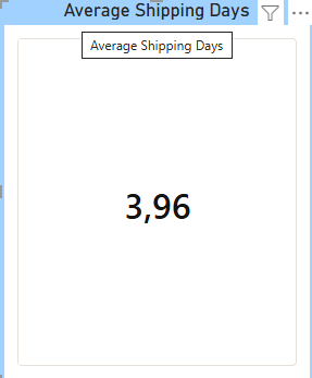
A single KPI card displaying the average number of days between order date and ship date across all orders. This is a key operational metric, a high average signals logistics issues; a low one reflects supply chain efficiency.
Chart 13 Profit by Ship Mode (Bar Chart)
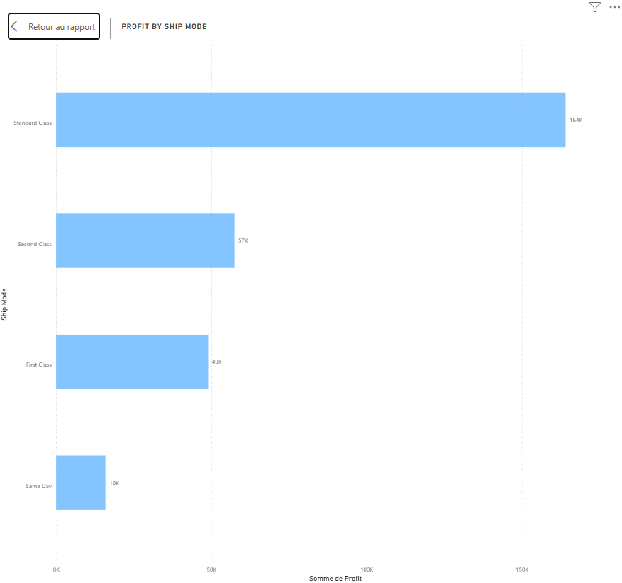
This chart compares profitability across the different shipping modes (Standard Class, Second Class, First Class, Same Day). It answers a critical question: does faster shipping come at the cost of profit margins?
Chart 14 Average Shipping Days by Ship Mode (Bar Chart)
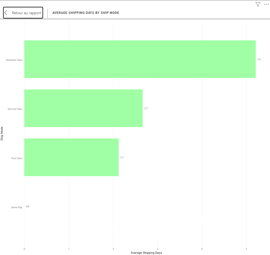
This chart shows the average delivery time for each shipping mode, making it easy to verify whether the modes are performing as expected (e.g., Same Day should have the lowest average, Standard Class the highest).
Chart 15 Average Shipping Days by Region (Bar Chart)
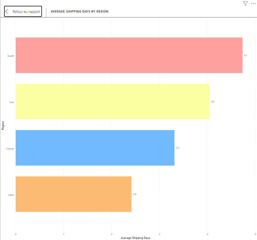
Shipping speed is compared across the four regions here. Regional disparities in delivery time can point to logistics bottlenecks or infrastructure differences that deserve attention.
Chart 16 Discount vs Profit (Scatter Chart)
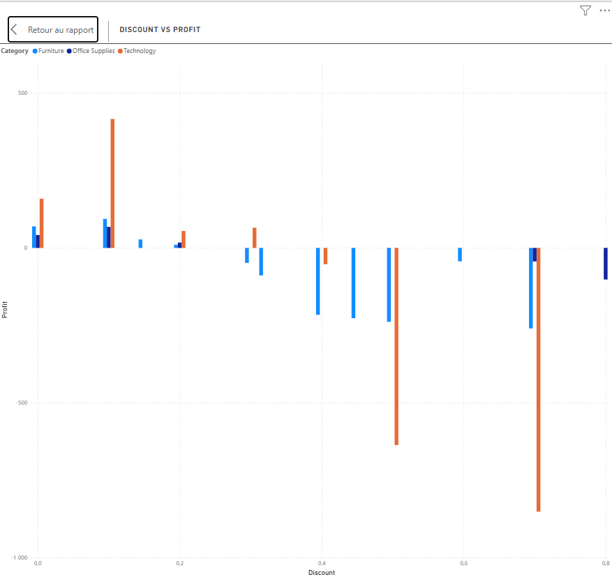
This scatter plot is one of the most analytically rich visuals in the report. Each point represents an order, plotted by its discount rate (X-axis) against its resulting profit (Y-axis). The expected and common finding is a negative correlation: higher discounts tend to destroy profit margins.
Chart 17 Sales and Profit per Month (Line Chart)
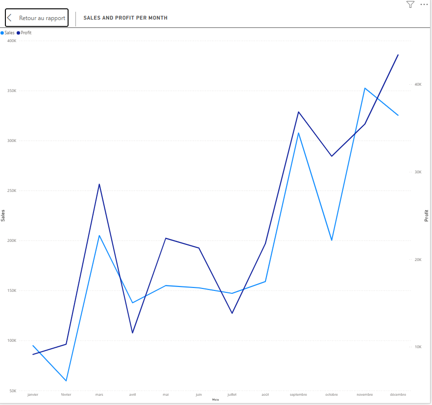 The final visual overlays monthly sales and profit on the same line chart, giving a direct comparison of both metrics over time. It closes the report by connecting revenue generation with bottom-line results.
Conclusion & Key Insights
After building and exploring this report across three interactive pages, several patterns emerged that provide a comprehensive view of the Superstore’s performance, highlighting both strengths and areas for improvement.
Sales Are Growing, but Profit Does Not Always Follow
The Month-Year Sales Trend demonstrates consistent year-over-year revenue growth, with noticeable seasonal peaks during the fourth quarter. However, the Profit Trend reveals that increasing sales do not always translate into higher profitability. In several periods, profit growth lags behind sales growth, indicating margin compression. Comparing both metrics makes it clear that revenue alone is not a sufficient measure of business performance.
Discounts Significantly Impact Profitability
One of the strongest insights from the report comes from the Discount vs. Profit scatter plot. A clear negative relationship exists between discount rates and profit: heavily discounted orders frequently generate little or even negative profit.
This suggests that while discounts may help increase sales volume, excessive discounting often comes at the expense of profitability. Revisiting the company’s pricing and discount strategy could have a substantial positive impact on overall margins.
Technology Is the Best-Performing Category
Among the three product categories, Technology consistently delivers both the highest sales and the strongest profits.
Office Supplies generates stable revenue while maintaining healthy profit margins, making it a reliable contributor to overall performance.
Furniture, however, presents a different picture. Although it produces significant sales revenue, profitability remains relatively weak. The sub-category analysis suggests that products such as Tables and Bookcases are particularly affected by aggressive discounting, reducing overall margins.
Regional Performance Is Uneven
The regional analysis shows that the West and East regions contribute the majority of the company’s profits.
In contrast, the Central region generates respectable sales but underperforms in profitability. This imbalance may be explained by regional pricing strategies, customer purchasing behavior, product mix, or discount practices, all of which warrant further investigation.
Standard Class Shipping Performs Best
Shipping mode analysis reveals that Standard Class is both the most frequently used shipping option and the most profitable.
Premium shipping methods such as First Class and Same Day provide faster delivery but tend to reduce profit margins due to higher operational costs. Encouraging customers to select premium shipping only when they are willing to absorb the additional cost could help maintain profitability.
A Small Number of Customers Drive a Large Share of Revenue
The Top 10 customer and product analyses demonstrate a classic retail pattern: a relatively small number of customers and products account for a disproportionate share of total revenue.
While these high-value customers represent an important growth opportunity, they also introduce concentration risk. Losing one of these key accounts could have a noticeable impact on overall business performance.
Recommendations
Based on the analysis, three strategic priorities stand out:
- Review the discount policy
- Introduce category-specific discount limits.
- Reduce excessive discounting, particularly within the Furniture category.
- Prevent transactions that generate negative profit.
- Replicate successful regional strategies
- Investigate why the West region consistently outperforms others.
- Apply successful pricing, sales, and operational practices to underperforming regions such as the Central region.
- Strengthen relationships with top customers
- Develop a structured customer retention or loyalty program.
- Focus account management efforts on the highest-value customers to protect a significant portion of overall revenue.
Final Thoughts
This dashboard demonstrates how Power BI can transform raw transactional data into actionable business insights through interactive visualizations and data storytelling.
By combining sales, profit, customer, regional, product, and shipping analyses, the report provides decision-makers with a clear understanding of where the business performs well and where opportunities for improvement exist.
Thank you for taking the time to explore this project. It forms part of my data analytics portfolio and showcases my ability to transform business data into meaningful insights using Power BI. Feedback and suggestions are always welcome. *This project was built with Power BI Desktop using the public Superstore sample dataset, as part of my ongoing data portfolio.